September 22, 2026
Why Update Brand Messaging: Essential Guide for Growth


Discover 10 powerful examples of visual branding. Learn how effective design boosts recognition and trust for small business owners.

TL;DR:
- Visual branding uses consistent design elements to communicate a brand’s identity instantly.
- Effective minimalism and vibrant styles help small businesses build recognition and emotional connection.
- Strong brand strategy and consistency ensure long-term trust and loyalty across all marketing channels.
Visual branding is defined as the system of consistent design elements, including logos, color palettes, typography, imagery, and iconography, that communicates a brand’s identity at a glance. For small business owners, coaches, and creative professionals, getting this system right is not optional. Consistent branding across every channel can increase revenue by up to 33%. That number reflects a simple truth: when people recognize you instantly, they trust you faster and buy more readily. The difference between visual identity and broader brand identity matters here. Brand identity is the full strategic picture, including your values, voice, and positioning. Visual identity is how that strategy shows up on screen and in print. Strong visual branding translates your strategy into something people can see, feel, and remember.

Minimalist visual branding uses the fewest possible elements to create the strongest possible impression. It strips away decoration and forces every design choice to carry real meaning.
Apple’s visual branding is the clearest model: a monochrome logo, a tight two-tone color palette, a proprietary typeface, and a tightly controlled photo style. Nothing competes for attention. The result is instant recognition before a single word is read. That level of discipline is not reserved for billion-dollar companies. Small businesses can apply the same logic by choosing one primary color, one typeface, and one logo lockup, then using them without exception.
Consider a solo business coach who uses a single serif font, an off-white background, and one accent color across her website, email newsletters, and Instagram grid. The consistency signals professionalism. Clients who land on her page from any channel feel the same experience. That coherence builds trust faster than any tagline.
Minimalism also scales cheaply. A simple logo works on a business card, a Zoom background, and a billboard without redesign. For founders working with limited budgets, that flexibility is a real financial advantage.
Key characteristics of effective minimalist visual branding:
Pro Tip: Before finalizing a minimalist logo, test it at 32 pixels wide. If it still reads clearly at that size, it will work everywhere.
Vibrant visual branding uses bold color, expressive typography, and illustration to communicate warmth, energy, and approachability. It works especially well for creative businesses, community-focused brands, and service providers whose personality is a core part of their offer.
Slack’s brand design is a textbook case. The platform combines vivid colors, playful illustrations, and modern typography within strict usage rules. The result balances warmth with graphic discipline. Nothing looks chaotic because the rules are clear, even when the palette is loud.
For a creative professional or coach, this approach signals that working with you will feel energizing rather than transactional. Color psychology plays a direct role here. Yellow communicates optimism. Coral signals warmth. Electric blue suggests confidence and clarity. Choosing colors that match your brand’s emotional promise is not a design preference. It is a business decision.
A children’s education brand might use rounded fonts, primary colors, and hand-drawn icons to signal safety and fun. A wellness coach might use sage green, warm cream, and flowing script to communicate calm and care. Both are examples of vibrant branding done with intention rather than impulse.
Features that define effective vibrant visual branding:
The critical rule is consistency. A playful brand that switches color palettes between Instagram and its website loses the trust it worked to build. Visual branding builds client loyalty only when the experience is the same across every touchpoint.
Custom typography is one of the most underused tools in small business branding. A bespoke typeface or a carefully chosen custom font turns text into a brand asset. It makes your brand recognizable even when the logo is not present.
Welcome to the Jungle’s custom ‘Welcome’ font is a strong example. The font unifies a massive volume of content across job listings, editorial articles, and marketing materials. Every headline feels like it belongs to the same brand, regardless of the topic. That cohesion is impossible to achieve with a generic system font.
For small businesses, commissioning a fully custom typeface is rarely the right first step. A more practical approach is selecting a distinctive licensed typeface and using it with strict discipline. Pair it with one neutral secondary font for body copy, then never deviate. Over time, that pairing becomes as recognizable as a logo.
Graphic elements work the same way. A consistent icon set, a signature pattern, or a recurring illustrative motif gives your brand a visual language that extends beyond the logo. A real estate coach might use a simple geometric house icon across all her materials. A fitness trainer might use bold diagonal lines as a recurring layout element. These choices unify diverse touchpoints without requiring a new design for every piece of content.
Practical considerations for custom typography and graphic elements:
Pro Tip: If you cannot afford a custom typeface, license a distinctive font from a reputable foundry and pair it with a free Google Font for body copy. The combination can feel just as ownable with consistent application.
Digital-first visual branding means building a brand system designed to live and perform online, not just in print. It includes interactive brand guidelines, digital asset libraries, and adaptable visual templates that teams can use without breaking the brand.
Dropbox’s online brand guidelines are a widely cited example of a living style guide. The guidelines are publicly accessible, easy to navigate, and updated in real time. Any team member, freelancer, or agency partner can access the correct logo files, color codes, and usage rules without emailing a designer. That accessibility prevents the visual fragmentation that happens when different people use different versions of brand assets.
Brand guidelines function as an instruction manual that prevents visual fragmentation as brands scale. For a small business owner managing a virtual assistant, a social media manager, and a web developer simultaneously, a clear digital style guide is the difference between a cohesive brand and a patchwork one.
A living brand system also means templates. Canva brand kits, Figma component libraries, and Google Slides decks pre-loaded with brand colors and fonts give non-designers the tools to produce on-brand content without guesswork. The brand stays consistent even when the founder is not personally reviewing every post.
The table below shows the core components of a functional brand guideline document, whether it lives online or in a PDF.
| Component | What it includes | Why it matters |
|---|---|---|
| Logo usage | Approved versions, clear space rules, prohibited uses | Prevents distortion and misuse |
| Color palette | Primary, secondary, and neutral colors with hex, RGB, and CMYK codes | Ensures color accuracy across print and digital |
| Typography | Primary and secondary typefaces, size scales, and weight hierarchy | Creates visual consistency in all written content |
| Imagery style | Photo tone, subject matter, and composition guidelines | Keeps photography feeling cohesive |
| Icon and graphic elements | Approved icon sets, patterns, and illustration style | Unifies visual language across touchpoints |
| Voice and tone | Approved language style, banned phrases, and example copy | Aligns written and visual identity |
Visual branding is a living system requiring flexible templates and rules to maintain consistency across varied touchpoints. That means guidelines should be updated whenever the brand evolves, not left static for years.
The right visual branding inspiration depends on your brand’s core story, your audience’s expectations, and your available resources. Copying a brand’s aesthetic without understanding its strategy produces a look that feels borrowed rather than owned.
Start by identifying what your brand needs to communicate emotionally. A financial coach who wants to signal trust and authority needs a different visual system than a creative director who wants to signal originality and boldness. The difference between brand identity and visual identity is the starting point for every design decision.
The biggest mistake is confusing visual identity with brand identity. Visual branding must express the strategic brand core, not just design for design’s sake. A beautiful logo that does not reflect your positioning is decoration, not strategy.
Steps for choosing and adapting visual branding examples:
Common pitfalls to avoid:
Effective brand visuals rely on repetition and cohesion rather than constant novelty to build mental brand models with consumers. Consistency is the mechanism. The examples you draw from are just the starting point.
Pro Tip: Before you hire a designer, write a one-paragraph description of how you want clients to feel when they encounter your brand. Give that paragraph to the designer before they open a single design file.
Visual branding does not operate in isolation. The most memorable brand identities connect design to story. Every color choice, font selection, and image style should reflect something true about the brand’s values and the people it serves.
Strong visual brands create a sensory experience that intuitively communicates core business values and builds trust. That experience is not accidental. It is the result of deliberate choices made at the strategy level before a single design file is opened. A brand that knows its story uses visual elements to reinforce that story at every touchpoint.
For coaches and consultants, personal branding is where this connection is most visible. Your face, your color palette, your font choices, and your photography style all communicate who you are before a potential client reads a single word of your bio. A coach who works with corporate executives might use a dark navy palette, clean sans-serif typography, and professional headshots in controlled lighting. A coach who works with creative entrepreneurs might use warm terracotta tones, expressive handwritten accents, and candid photography. Both are correct. Both are strategic.
The brand storytelling principles that drive emotional connection in written content apply equally to visual content. Specificity, authenticity, and consistency are the three qualities that make a brand story land, whether it is told in words or in design.
The most effective examples of visual branding across every industry share three qualities. They are consistent, they are intentional, and they are built on a clear brand foundation rather than aesthetic preference alone.
Approximately 80% of consumers trust brands that maintain a coherent visual system across all channels more than those that do not. That trust is earned through repetition, not novelty. Every time a potential client sees your brand and it looks exactly as they remember, you make a small deposit into their trust account. Over time, those deposits compound into loyalty.
Visual identity includes logos, typography, colors, motion, imagery, iconography, layouts, packaging, and digital brand behavior. Managing all of those elements consistently is the real work of visual branding. It is not a one-time project. It is an ongoing discipline.
To avoid brand fragmentation, lock your key elements, logo placement and primary colors, while allowing secondary elements to adapt across channels and campaigns. That flexibility within a fixed structure is what lets a brand feel fresh without losing recognition.
The most common mistake I see founders make is treating visual branding as the starting point rather than the output of a deeper strategy process. They hire a designer before they can clearly articulate who their brand is for, what it stands for, and why it is different. The result is a beautiful logo attached to a brand with no clear direction.
Every client I have worked with who invested in brand clarity first, before touching a design file, ended up with a visual identity that actually held up over time. They did not need to rebrand six months later because the design reflected something real. It reflected their positioning, their audience, and their values. That foundation is what makes visual branding durable rather than decorative.
The other lesson I would share is that consistency is more powerful than creativity in the early stages of building a brand. A simple, consistent visual system applied for 12 months will outperform a beautiful but inconsistently applied brand every time. Recognition is built through repetition. Clients remember what they see repeatedly, not what impressed them once.
If you are a coach or creative professional reading this, the most valuable thing you can do right now is audit your existing brand touchpoints. Open your website, your Instagram profile, your email signature, and your most recent proposal document. Do they look like they belong to the same brand? If the answer is no, that is where to start.
— Kaitlyn Cole
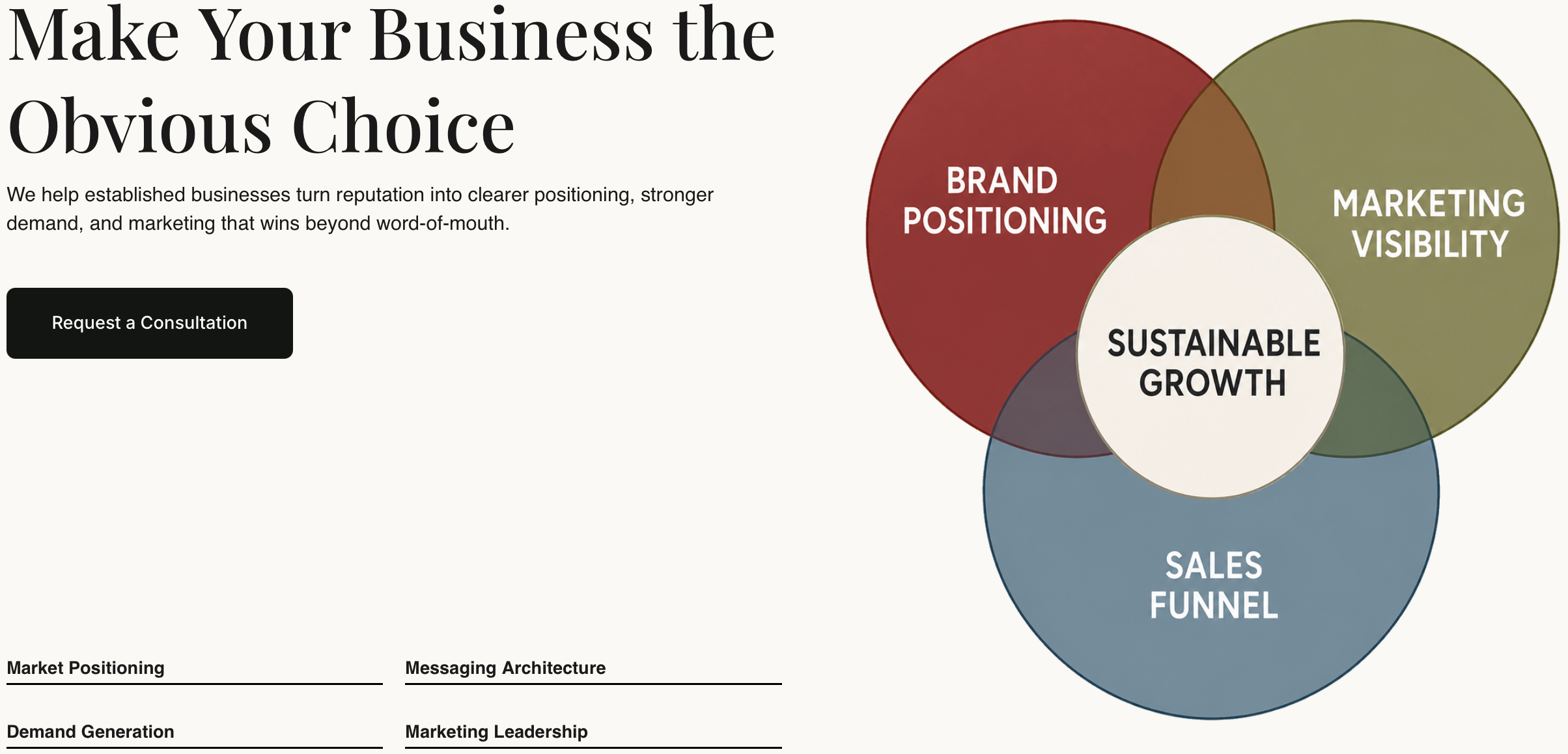
Reasonate Studio works with founders, coaches, and consultants who are ready to move from scattered visuals to a brand that looks and feels consistent everywhere it shows up. The work starts with brand clarity, the strategy layer that makes every design decision intentional rather than arbitrary. From there, Reasonate Studio builds the messaging, content, and visual direction that turns a brand into a recognizable presence online.
If your brand needs stronger positioning alongside its visual identity, sales page optimization and SEO keyword research are two areas where Reasonate Studio helps brands show up clearly and convert more effectively. The visual system and the marketing strategy work together, not in separate silos.
Visual branding includes logos, typography, color palettes, imagery, iconography, layouts, and digital behavior. These elements work together to create a consistent, recognizable brand experience across every channel.
Brand identity is the full strategic picture, including values, voice, and positioning. Visual identity is how that strategy appears in design. Visual branding must express the strategic brand core, not just design for aesthetics.
Consistent branding across channels can increase revenue by up to 33%. For small businesses, consistency builds trust faster and reduces the time it takes for new clients to feel confident in your brand.
A focused palette of two to three primary colors is the standard for most small business brands. A tight palette is easier to apply consistently and creates stronger recognition over time.
Document brand guidelines only after your visual system has been tested and finalized. Premature documentation leads to costly rebranding when the strategy shifts.