June 29, 2026
Discover how a strong brand visual identity can enhance recognition, trust, and efficiency for your small business. Unlock your brand's potential!
TL;DR:
- A strong brand visual identity helps small businesses build trust and recognition across every touchpoint.
- Consistency in design elements reduces marketing rework, speeds up content creation, and enhances credibility.
Brand visual identity is the complete system of visual elements that represents your business and shapes how people recognize, remember, and trust you across every touchpoint. For small business owners, coaches, and consultants, this system is not a luxury. It is the foundation that determines whether a prospect sees you as credible or forgettable the moment they land on your website, scroll past your social post, or open your email. A cohesive visual system reduces marketing rework by 30–50% through defined design rules and templates. That kind of efficiency matters when you are running a business without a full marketing team behind you.
Brand identity design encompasses logo, colors, typography, imagery, and tone of voice to make every piece of content feel cohesive and on-brand. Each element carries a specific job. Together, they create instant recognition.
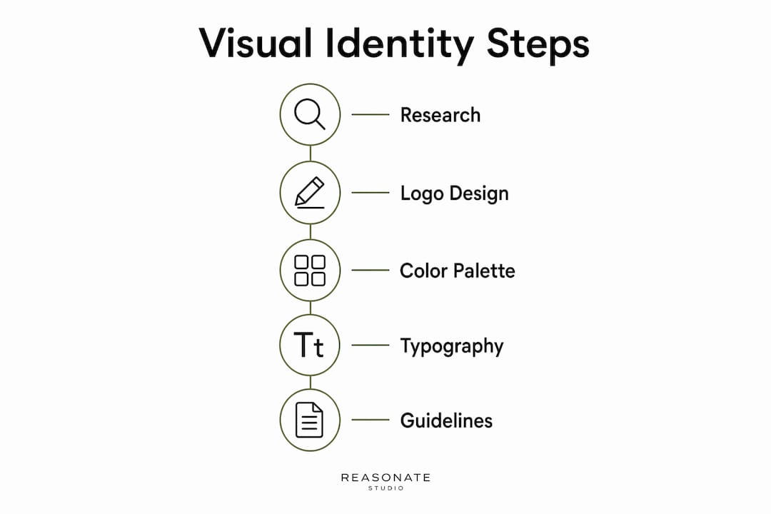
Here is what a complete visual identity system includes:
Each component works as part of a system, not in isolation. A logo without a defined color palette gets reproduced inconsistently. A color palette without typography rules produces content that looks off even when the colors are right. The power of visual identity and branding comes from the integration of all these elements into one unified, repeatable system.
Pro Tip: When building your color palette, define exact hex codes, RGB values, and CMYK values for each color. Vague color descriptions like “navy blue” produce different results across different screens and printers.

Brand guidelines are the most important deliverable in any visual identity project. They prevent fragmentation and maintain consistent application across teams, contractors, and marketing materials. Without them, your visual identity exists only in your designer’s files and your own memory.
The difference between brand identity and brand guidelines is worth understanding clearly. Your brand identity is the visual system itself: the logo, colors, fonts, and imagery. Your brand guidelines are the rulebook that explains how to use that system correctly. You need both.
When guidelines are missing, these problems appear quickly:
Each of these situations forces prospects to relearn your brand at every touchpoint. That repetitive relearning slows trust-building and weakens recognition. In coaching and consulting, where clients are making high-trust decisions about who to work with, inconsistency signals internal disorganization. It costs you credibility before you ever get on a call.
Inconsistent visual identity signals internal disorganization to prospects, compromising perceived authority and credibility, especially in regulated or high-trust fields. That finding is particularly relevant for coaches and consultants, whose entire value proposition rests on being seen as capable, organized, and trustworthy.
Brand guidelines solve this by converting visual elements into rules and templates, defining what is locked and what is flexible. Locked elements include your logo, primary colors, and core typefaces. Flexible elements include layout options, image choices, and caption styles. This structure gives you and anyone working on your brand a clear framework to operate within.
Pro Tip: Keep your brand guidelines in a shared, accessible document, such as a Google Doc or Notion page, so every contractor and team member can reference it without asking you for direction every time.
A well-built visual identity system does more than make your brand look good. It makes your marketing faster, your trust-building more reliable, and your market expansion more achievable.
The efficiency gain is concrete. A consistent visual identity reduces marketing rework by 30–50% through defined design rules and templates. For a small business owner or solo consultant, that means fewer hours spent recreating assets from scratch, fewer revisions sent back to designers, and faster content production overall. Time saved on rework is time redirected toward client work and revenue.
“Every touchpoint is an opportunity to reinforce who you are. When your visual identity is consistent, that reinforcement happens automatically. When it is not, every touchpoint creates doubt instead of confidence.”
The trust effect compounds over time. Prospects who see your brand repeatedly across multiple channels, and who see the same colors, fonts, and visual style each time, build familiarity faster. Familiarity reduces the perceived risk of hiring you. In high-trust fields like coaching and consulting, that reduced risk directly influences buying decisions.
Consistent brand identity enables entering new markets with faster recognition and trust because every touchpoint reinforces the brand. This matters when you expand your services, launch a new offer, or start showing up on a new platform. A strong visual system travels with you. Prospects who encounter your brand for the first time on LinkedIn, for example, will recognize it immediately when they visit your website because the visual language is the same.
Brand equity also accumulates. Every piece of content you publish, every email you send, and every social post you share either adds to or subtracts from the cumulative impression your brand makes. A consistent visual identity means every piece adds to the same recognizable whole. Over months and years, that accumulation becomes a real competitive advantage that is very difficult for a newer competitor to replicate quickly.
For practical growth, consider these applications:
Building a strong visual identity starts before any design work begins. Brand identity must align with values, mission, and positioning to ensure the design represents who the organization is and where it is headed. Skipping this foundation produces a logo that looks fine but feels hollow because it is not connected to anything real.
Follow these steps in order:
Pro Tip: Lock your logo file, color codes, and primary font choices in a shared folder that only you can edit. Give contractors access to your templates and guidelines, not to the source files.
After working with over 100 founders, coaches, and consultants at Reasonate Studio, the pattern I see most often is this: business owners invest in a logo and call it done. They treat the logo as the brand. Then they wonder why their marketing feels scattered, why their content looks inconsistent, and why prospects are not converting the way they expected.
The logo is not the brand. It is one element of a much larger system. The businesses that grow fastest are the ones that treat their visual identity as an operational tool, not just a design asset. They build the guidelines. They create the templates. They apply the system consistently, even when it feels tedious.
The second mistake I see constantly is building a visual identity without a brand foundation underneath it. Founders choose colors they like, fonts that look modern, and a logo that feels right. But when I ask them what their brand values are, or who their ideal client is, or what makes their offer different, the answers are vague. A visual identity built on a vague foundation will always feel off, even if the design itself is technically good.
The guidelines are the pivot point that turn a static logo into a living system that scales as your business grows. I have seen this firsthand. Clients who come to us with guidelines already in place move faster, produce better content, and spend less time in revision cycles. Clients who come without guidelines spend the first several weeks just getting aligned on what the brand actually looks and sounds like.
My honest advice: invest in your guidelines before you invest in more content. More content produced from a broken or undefined visual system just creates more inconsistency at scale. Get the foundation right first, and everything else becomes faster and more effective. You can explore brand building strategies for coaches to see how this plays out in practice.
— Kaitlyn Cole
Building a strong visual identity is only half the equation. The other half is making sure that identity shows up on every page, post, and sales asset in a way that actually moves people to buy.
At Reasonate Studio, the Brand Intelligence pillar of the Aligned Impact Model™ connects your visual identity to your messaging, your offers, and your sales system. That connection is what turns a polished brand into a revenue-generating one. If your visual identity is solid but your sales page is not converting, the problem is usually a disconnect between how your brand looks and how it speaks. Reasonate Studio’s sales page optimization service closes that gap by aligning your brand visuals, copy, and offer structure into one cohesive, conversion-ready experience. If you are ready to make your brand work harder for your business, that is exactly where to start.
Brand visual identity is the complete system of visual elements, including logo, color palette, typography, and imagery, that represents a business and shapes how it is recognized across all channels. It is distinct from brand identity, which also includes values, mission, and positioning.
The core brand design elements are the logo and its variations, a defined color palette with exact color codes, a typography system with clear hierarchy, a consistent imagery style, and supporting graphic elements. All five must work together as a unified system.
Inconsistent visual identity signals disorganization to prospects and directly harms credibility in high-trust fields like coaching and consulting. A consistent visual identity builds familiarity faster and reduces the perceived risk of hiring you.
Brand identity is the visual system itself: the logo, colors, fonts, and imagery. Brand guidelines are the rulebook that explains how to use those elements correctly across all materials and channels. You need both for the system to function.
A consistent visual identity system reduces marketing rework by 30–50% through defined design rules and reusable templates. Guidelines eliminate guesswork for contractors and team members, which speeds up content production and reduces revision cycles.