June 20, 2026
Brand identity typography empowers small businesses to foster trust, boost recognition, and create consistency. Learn font types, style systems, and top mistakes to avoid.
Most American entrepreneurs underestimate the power typography holds in shaping brand perception. In fact, bold typographic choices can impact customer trust and recognition by over 30 percent, according to industry research. For service-based businesses aiming to stand out in a crowded North American market, mastering brand identity typography offers a direct route to consistent messaging and stronger connections with ideal clients. This guide reveals how aligned typography makes your marketing more memorable and authentic.
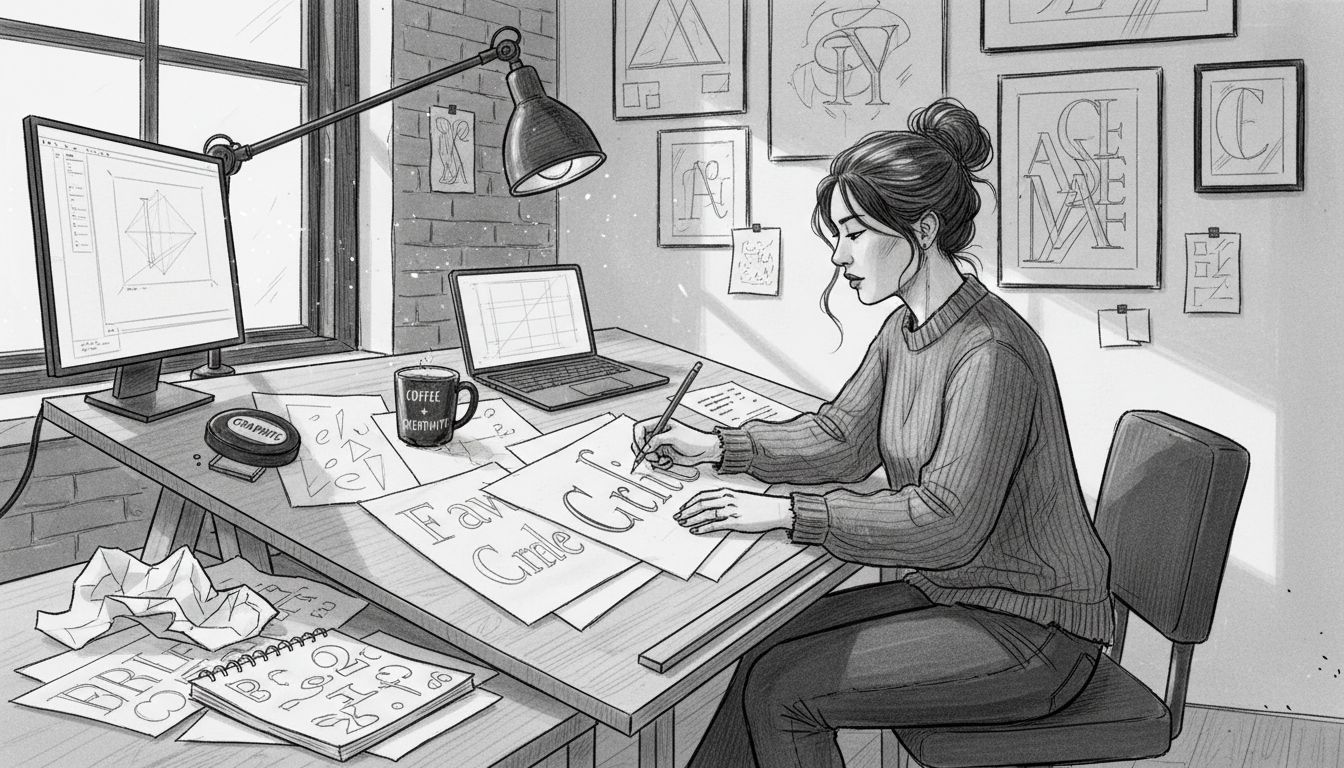
Typography isn’t just about selecting attractive letters - it’s a strategic communication tool that transforms visual language into brand narrative. At its core, brand identity typography represents the intentional selection and application of typefaces that visually express a company’s personality, values, and emotional essence.
Research from Springer demonstrates that fonts communicate far more than words - they convey implicit semiotic meanings through explicit physical dimensions. Specific typographic properties like weight, contrast, and x-height can profoundly influence how customers perceive and connect with a brand. A bold, sharp font might signal strength and confidence, while a soft, rounded typeface could communicate approachability and warmth.
Understanding typography’s psychological impact requires recognizing how different type characteristics trigger specific emotional responses. Understanding Brand Identity Essentials for Your Business reveals that typography acts as a silent communicator, transmitting brand personality before a single word is read. Serif fonts often suggest tradition and reliability, while sans-serif designs communicate modernity and simplicity. The strategic alignment between typographic choice and brand positioning can significantly enhance audience trust and recognition.
Pro tip: When selecting typography, conduct a brand personality audit and choose fonts that authentically represent your business’s core values and target audience expectations.
Font categories serve as visual storytellers, communicating brand personality through strategic typographic choices. Research consistently demonstrates that different font styles trigger specific psychological responses, making typography a powerful nonverbal communication tool for businesses seeking to establish immediate brand recognition.
The two primary font categories - Serif and Sans-Serif - offer distinct brand messaging opportunities. Serif fonts, characterized by small decorative lines attached to letter edges, traditionally signal brand heritage and reliability. Financial institutions, academic publications, and established consulting firms often leverage serif typography to communicate trustworthiness and historical depth. Conversely, sans-serif fonts with their clean, minimalist design communicate modernity, innovation, and simplicity - making them popular among technology companies, startup brands, and organizations wanting to project a contemporary aesthetic.
Beyond serif and sans-serif classifications, specialized font categories like script, display, and monospace fonts provide nuanced branding opportunities. Script fonts can evoke elegance and personal touch, while display fonts allow dramatic, attention-grabbing communication. Scientific research indicates that consumers are twice as likely to engage with brands when typography authentically matches the brand’s personality and industry expectations, underscoring the strategic importance of intentional font selection.
Here’s a summary of primary font categories and their typical brand associations:
| Font Category | Key Trait | Common Brand Persona | Typical Industry Examples |
|---|---|---|---|
| Serif | Decorative strokes | Established, trustworthy | Financial, education, consulting |
| Sans-Serif | Clean, simple forms | Modern, innovative | Tech, startups, lifestyle |
| Script | Flowing, handwritten | Elegant, personal touch | Hospitality, luxury, events |
| Display | Bold, attention-grabbing | Dramatic, creative | Entertainment, retail, campaigns |
| Monospace | Fixed-width characters | Technical, reliable | Digital, coding, technology |

Pro tip: Create a font palette with 2-3 complementary typefaces that represent different hierarchical roles while maintaining a cohesive visual identity across your brand materials.
Typography systems transform random font selections into intentional brand communication frameworks. Building a strategic approach requires understanding typography not just as visual decoration, but as a structured communication platform that guides audience perception and brand consistency across multiple touchpoints.
Design systems research emphasizes creating hierarchical typography frameworks with clearly defined roles for each font style. Understanding the Advantages of Strategic Branding reveals that successful typography systems typically include 3-5 core type classifications: headline, subheadline, body text, captions, and optional accent text. Each classification should have specific parameters including size, weight, line height, and letter spacing, ensuring predictable and cohesive visual communication.
Establishing typography tokens allows brands to create scalable, adaptable systems that work seamlessly across digital and print platforms. Designers should develop a comprehensive type scale that considers readability, brand personality, and technical constraints. This means selecting typefaces that maintain legibility across different screen sizes, resolutions, and mediums while consistently representing the brand’s core visual identity. Advanced typography systems also incorporate responsive design principles, allowing fonts to gracefully adjust to various device contexts without losing their fundamental character.
Pro tip: Create a typography style guide that documents every font’s specific use case, including precise measurements, color specifications, and acceptable variations to maintain brand consistency.
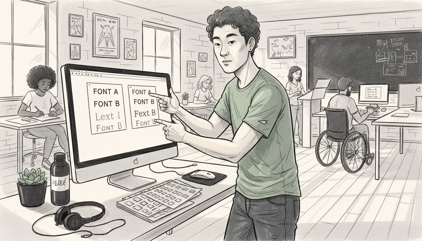
Font pairing is an art form that transforms disparate typefaces into a harmonious visual language representing your brand’s personality. Successful font combinations require understanding how different typefaces interact, complement, and communicate a cohesive narrative across various brand touchpoints.
Professional design research highlights three primary strategies for effective font pairing. First, leverage superfamilies - font families with multiple weights and styles that inherently work together. Second, create visual hierarchy through strategic contrast by combining fonts with distinct characteristics - such as pairing a bold, dramatic headline font with a clean, readable body text font. How to Improve Brand Recognition for Lasting Impact emphasizes that these intentional typographic choices can significantly enhance brand memorability and audience engagement.
Consistent font usage extends beyond initial selection, requiring careful implementation across digital and print platforms. Designers should establish clear guidelines for font application, including specific rules about size, weight, spacing, and acceptable variations. This systematic approach ensures that your typography maintains its integrity whether displayed on a mobile screen, business card, or billboard. The key is developing a flexible yet disciplined typography system that adapts to different contexts while preserving the core visual identity.
Pro tip: Develop a font pairing matrix that documents acceptable font combinations, specifying exact use cases for each typeface to maintain brand consistency across all communication materials.
Typography mistakes can silently undermine your brand’s professional image and expose businesses to unexpected legal risks. While creative font selection might seem like a simple design choice, it encompasses complex considerations that extend far beyond aesthetic preferences.
The most prevalent typography errors typically involve inconsistent font usage and unauthorized font licensing. Entrepreneurs often unknowingly commit serious brand integrity violations by randomly selecting fonts without understanding their legal implications. Understanding the Advantages of Strategic Branding highlights that commercial font usage requires careful navigation of licensing agreements. Many designers accidentally use fonts without proper permissions, which can result in costly legal challenges, potential copyright infringement claims, and mandatory retroactive licensing fees.
Legal pitfalls in typography emerge through multiple channels - from improper font licensing to inconsistent brand representation. Designers must verify font usage rights for every typeface, understanding whether a font is licensed for personal, commercial, web, or print use. Different licensing models exist for desktop, web, app, and digital advertising applications, making comprehensive research crucial. Some fonts require separate licenses for each platform, while others offer comprehensive packages. Businesses should maintain meticulous documentation of font licenses, tracking usage rights, modification permissions, and distribution restrictions to protect their brand and avoid potential legal disputes.
Below is a practical comparison of common typography mistakes versus best practices for brand consistency:
| Mistake | Potential Impact | Best Practice for Brands |
|---|---|---|
| Inconsistent font usage | Confused brand perception | Use a documented style guide |
| Unauthorized font licensing | Legal risks, extra costs | Track and audit font licenses |
| Poor font pairing | Unprofessional look, poor recall | Develop a pairing matrix |
| Ignoring platform needs | Illegible on some devices | Test and adapt for each platform |
Pro tip: Conduct a comprehensive font license audit annually, documenting each font’s specific usage rights and maintaining a centralized licensing repository to prevent accidental copyright infringement.
Choosing the right typography is more than a design choice. It is a vital part of building trust and recognition with your audience. If you struggle with inconsistent font usage, confusing brand personality, or want to avoid costly legal pitfalls related to font licensing, you are not alone. This article showed the power of purposeful typography and its impact on brand perception. At Reasonate Studio, we understand these challenges and integrate them into a comprehensive branding system that aligns your visual language with your core business values.
Partner with Reasonate Studio to develop a strategic typography system within The Aligned Impact Model™ that supports sustainable growth and elevates your brand clarity. We work with entrepreneurs and small businesses to create intentional design that resonates deeply and creates lasting connections. Visit Reasonate Studio to learn how to avoid common typography mistakes with expert guidance and actionable steps. Start building a consistent and legally sound visual identity that attracts the right customers today by exploring Understanding Brand Identity Essentials for Your Business and discover proven strategies at How to Improve Brand Recognition for Lasting Impact. Your brand’s next level is just one smart decision away.
Brand identity typography refers to the intentional selection and application of typefaces that visually express a company’s personality, values, and emotional essence, serving as a strategic communication tool.
Typography can influence how customers perceive and connect with a brand. Different type characteristics can trigger emotional responses, either conveying strength and confidence or approachability and warmth.
The main font categories include Serif (established and trustworthy), Sans-Serif (modern and innovative), Script (elegant and personal), Display (dramatic and creative), and Monospace (technical and reliable). Each category serves distinct branding purposes.
To avoid typography mistakes, maintain consistent font usage by using a documented style guide, ensure proper font licensing, and develop a font pairing matrix. Regularly audit font licenses to prevent legal issues.